Graphs 2 Properties
 Reference Contents > Graphs 2 > Graphs 2 Properties
The Graphs 2 Properties window will open automatically when a Graph is to be maintained in the Graphs 2 Maintenance window. And it operates interactively with that window and its toolbar. For an overview of Graph 2 functions and operation see the Introduction to Graphs 2 topic.
The window has 15 tab panes.
Basics
Data Layers
Layout
Colours
X-Y
X-Y Axis
Pie
Polar
Meter
Texts
Marks
Zones
Pointers
Rings
Files
Basics
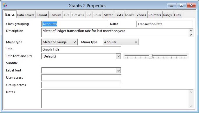
To change the basic properties of the graph 2 design.
|
Field |
Description |
|---|---|
|
Class grouping |
The class grouping of the graph. This can be used to group graphs for convenience. |
|
Name |
The name of the graph. This must be unique and is used to identify this graph design within other program modules. |
|
Description |
A description of the graph in more detail than the name. This helps users select it when needed. |
|
Major type |
The major graph type. Select from the list. |
|
Minor type |
The minor type for the graph. Listed options will change with the major type selection. |
|
Title |
The main title of the graph. You can use CDML syntax. |
|
Title font |
Specifies the font for the title. (Default) or blank will lead to the default being used, typically Times Roman. Any other Font needs to be located in the Fonts folder of the Omnis executable. Any fonts present will be listed. See Introduction to Graphs 2 for details about font use. |
|
Title size slider |
The slider controls the font size to be used. |
|
Subtitle |
Some graph types permit a subtitle. You can use CDML syntax. |
|
Label font |
The Font to be used for graph labels. |
|
User access |
A comma separated list of Users that are permitted to use the graph design. If both Group and User access are blank there are no restrictions on the use of the graph design. |
|
Group access |
A comma separated list of User Groups that are permitted to use the graph design. If both Group and User access are blank there are no restrictions on the use of the graph design. |
|
Notes |
Notes on the use of the graph design. These will appear on the website if the graph is uploaded to the graph repository. |
Data Layers
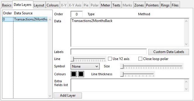
Attributes of the main data layer and to add extra data layers to the graph.
|
Field |
Description |
|---|---|
|
Data Source Layer List |
A list of data layers for this graph. Use the delete key to remove unwanted ones. Click to show and edit details on the right. There is always a main layer with order of zero. |
|
Order |
The order of drawing layers. Zero is the main layer. 1 is drawn behind then 2 behind that, etc. |
|
Type |
For additional layers (other than layer 0) you can specify the type of plot for the layer. This is the same list as the Minor type for the graph. Select from the list. |
|
Method |
The extra layer can be drawn overlaying or relative to the main data layer (layer 0).
|
|
Data |
The data source for the layer. This is either a named source, a comma-delimited list of values or value-multiples with or without square bracket indirect notation. Multiple data sources are delimited by a new line. There is an in-depth explanation of alternative methods of populating graph data in the Introduction to Graphs 2, Data Sources section. Right-click to get a menu of extra functions. |
|
Labels |
The format for the data labels on the layer. e.g. £{value|0.,}. It can also contain square-bracket notation, for instance [kCr] to force a new line. There is an in-depth explanation of the potential use of this in the Introduction to Graphs 2 topic. See also Custom Data Labels button described below. |
|
Line |
Use the slider to size the thickness of the plot line for this layer, if a line plot. |
|
Use Y2 axis |
The layer will be scaled to the Y2 axis rather than the Y axis. |
|
Close loop polar |
For polar line type plots, check this option to close the plot. |
|
Symbol |
You can choose a data symbol for some types of graph layer. |
|
Size |
Use the slider to control the size of the symbol. |
|
Fill colour |
The fill colour of the symbol. Click to select from the colour picker. |
|
Edge colour |
The edge colour of some symbols. Click to select from the colour picker. |
|
Line thickness |
The line thickness of some symbol types. |
|
Extra fields list |
The data source for extra fields for the layer’s data points used for labels with {field0,1,2…} syntax. Each set, delimited by a new line, is either a named source, a comma-delimited list of values with or without square bracket indirect notation. There is an in-depth explanation of alternative methods of populating graph data in the Introduction to Graphs 2, Data Sources section. |
|
Button |
Action |
|---|---|
|
Add Layer |
Click to add an extra layer to the graph. |
|
Custom Data Labels |
Click to maintain custom data labels for the layer on the graph. This will open the Graphs 2 Layer Custom Data Labels window where data can be maintained. |
Layout
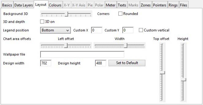
To change the layout properties common to many graph types.
|
Field |
Description |
|---|---|
|
Background 3D |
Use the slider to control the depth or height of the effect. This applies to the background of the chart and not the chart itself. |
|
Rounded |
If checked the corners of the background space are rounded. |
|
3D on |
If checked the chart is drawn with a 3D appearance (not supported on all types). |
|
3D depth |
When 3D is on use the slider to control the depth of the effect. |
|
Legend position |
The position of the legend block. Select from the alternatives. |
|
Custom X |
Manual vertical position of the legend when Custom is selected. |
|
Custom Y |
Manual horizontal position of the legend when Custom is selected. |
|
Custom vertical |
If checked, the manual position of the legend is vertical. |
|
Chart area offsets |
The four sliders allow you to size and position the chart area in the space available. This is particularly useful if you have long axis labels and with meter type charts. |
|
Wallpaper file |
The filename including suffix of the graphic file used for a wallpaper background. Image files such as this must be available in the Graphs/Images folder of the local Caliach Vision folder tree. For more details see the a External Files (Images and Fonts) section of the Introduction to Graphs 2 topic. |
|
Design width and height |
These values are not strictly for the graph itself but for use by Caliach Vision to size or proportion the graph when shown on a window. You can think of it as the default size and aspect ratio of the design. When Caliach Vision renders a graph in a particular space it uses these ideal design dimensions to factor many absolute dimensions used in the design. For example, while font sizes in the design are all in absolute pixel size, when the graph is shown in a much smaller size space the text would look disproportionately large. So Caliach Vision adjusts the font size based on these ideal design dimensions to try and maintain proportional position and size. The trick here is to design the graph with the Graphs 2 Maintenance window sized appropriately for the appearance you want or expect to see when in use. Then during the design process click on the Set to Default button which will load the Design width and height fields with the size of the graph you are viewing. You can see the effect of this by changing the size and aspect ratio of the Graphs 2 Picture window that also opens when the Graphs 2 Maintenance window renders a graph to show you a picture of the graph rather that using the graph object embedded in a window or report. The picture is a snapshot image of an appropriate size taken of the graph with this factoring applied.
|
 WARNING: Image files used in Wallpaper or
 |
Button |
Action |
|---|---|
|
Set to Default |
Click to set the design size to the current illustrated graph. |
Colours
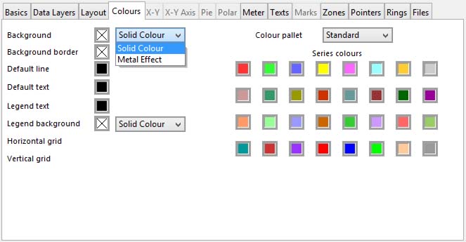
To change the colour properties common to all graph types.
|
Field |
Description |
|---|---|
|
Background colour |
The graph background colour. Click to select from the colour picker. |
|
Background colour effect |
Select from the list the effect you want. |
|
Background border colour |
The graph background border colour. Click to select from the colour picker. |
|
Default line colour |
The default line colour. Click to select from the colour picker. |
|
Default text colour |
The default text colour. Click to select from the colour picker. |
|
Legend text colour |
The legend text colour. Click to select from the colour picker. |
|
Legend background colour |
The legend background colour. Click to select from the colour picker. |
|
Legend colour effect |
Select from the list the effect you want. |
|
Horizontal grid colour |
The horizontal grid colour (applies to only some graph types). If it is set to the default colour there are no grid lines shown. Click to select from the colour picker. |
|
Vertical grid colour |
The vertical grid colour, as above. |
|
Colour pallet |
There are a number of alternative pallets that can be used for graph colours. Choose from the list. |
|
Series colour |
The colours used in the graph to identify the data series. Click on each to change the colours. Numbered from left to right then down. |
X-Y
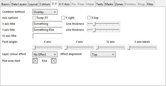
To change properties specific only to X-Y type graphs.
|
Field |
Description |
|---|---|
|
Combine method |
The combine method for multiple series of data. This is similar to the the method used when combining layers but in this case applies to layer zero when multiple data sources are applied.
|
|
Swap XY |
If checked the X and Y axis are swapped. |
|
Y right |
If checked the Y axis will be displayed on the right side rather than the left. |
|
X top |
If checked the X axis is to be displayed on the top rather than the bottom. |
|
X axis title |
The title of the X axis. You can use CDML syntax. |
|
X axis line thickness |
Use the slider to set the axis line thickness for the. |
|
Y axis title |
The title of the Y axis. You can use CDML syntax. |
|
Y axis line thickness |
Use the slider to set the axis line thickness for the. |
|
Y2 axis title |
The title of the Y2 axis. You can use CDML syntax. |
|
Font angles |
Use the sliders to change the angle of text for the titles and the X axis labels. |
|
Layer colour effect |
Select from the list the effect you want. |
|
Effect alignment |
Select from the list the orientation for the effect. |
|
Plot area start colour |
The plot area (as opposed to the graph area) start colour to get a colour gradient across the plot area. Click to select from the colour picker. |
|
Plot area end colour |
The plot area end colour. Click to select from the colour picker. |
X-Y Axis
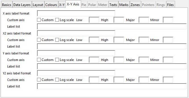
To change axis properties specific only to X-Y type graphs.
All four potential axis, X, X2, Y and Y2 have the same attributes and are only listed once below.
|
Field |
Description |
|---|---|
|
Axis label format |
The format for the data labels on the axis. e.g. £{value|0.,}. It can also contain square-bracket notation, for instance [kCr] to force a new line. There is an in-depth explanation of the potential use of this in the Introduction to Graphs 2 topic. You can also have a custom set of labels set up in the Label list below. |
|
Custom |
Check to use a custom custom defined by the Low, High, Major, Minor values you enter. |
|
Log scale |
Check if the custom axis is a log scale rather than linear. |
|
Low custom value |
The low absolute value for the custom axis. |
|
High custom value |
The high absolute value for the custom axis. |
|
Major custom value |
The major tick quantity for the custom axis. |
|
Minor custom value |
The minor tick quantity for the custom axis. |
|
Label list |
A comma separated list of labels for each major tick mark label for the axis. If something is entered here, the normal numeric custom axis labelling will not apply. Instead the labels listed will be evenly distributed along the axis. If only one is entered it will be at the base. For example, if you enter Low,Medium,High the axis base will show Low, the high end will show High and at the centre will be Medium. You can use CDML syntax. |
Pie
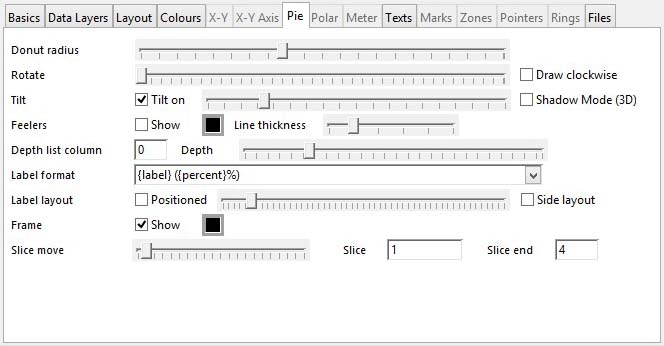
To change properties specific only to Pie type graphs.
|
Field |
Description |
|---|---|
|
Donut radius |
Use the slider to increase the inner radius for a donut style pie chart. |
|
Rotate |
Use the slider to rotate the pie chart relative to a top centre starting point. |
|
Draw clockwise |
Check to draw each slice clockwise rather than the normal anti-clockwise. |
|
Tilt on |
If checked the pie is tilted and the slider controls the extent of the tilt. Note that the 3D checkbox on the Layout tab pane effect this appearance. |
|
Shadow Mode (3D) |
Applies a 3D shadow mode to the pie, removing all tilt. Note that the 3D checkbox on the Layout tab pane must be checked for the effect to apply. |
|
Show feelers |
If checked feelers (or pointers from the label to the slice) are switched on. Note that if Label layout Positioned checkbox is set feelers will not show. |
|
Feeler colour |
The colour of the feeler lines. Click to select from the colour picker. |
|
Feeler line thickness |
Use the slider to control the feeler line thickness. |
|
Depth list column |
The column number of the underlying data list to use to set the individual slice depths. |
|
Depth |
Use the slider to set the depth of the pie itself. |
|
Label format |
The format for the data labels on the pie slices. e.g. {label} ({percent}%). It can also contain square-bracket notation, for instance [kCr] to force a new line. There is an in-depth explanation of the potential use of this in the Introduction to Graphs 2 topic. |
|
Label layout Positioned |
If checked the slider setting of position overwrites the normal automatic positioning. Note that if Positioned is checked Feelers (above) will not show. |
|
Side layout |
If checked the labels are displayed on the sides of the pie rather than around it. |
|
Frame: Show |
If checked there is a frame round each slice of the pie chart. |
|
Frame colour |
The colour of the frame lines. Click to select from the colour picker. |
|
Slice move |
Use the slider to move a slice of the pie away from the centre. |
|
Slice to move |
The number for the slice to move, or a comma separated list of slices. E.G. 1,3 will lead to the first and third slices being moved out from the pie. |
|
Slice end |
An optional end slice to move to provide a range from Slice to Slice end. |
Polar
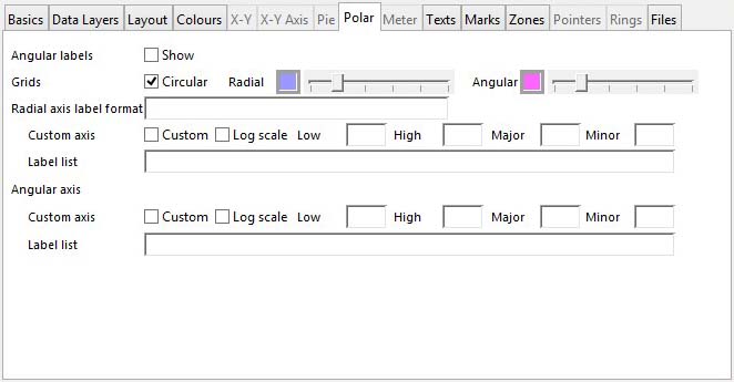
To change properties specific only to polar charts.
|
Field |
Description |
|---|---|
|
Angular labels: Show |
Check to show angular labels. |
|
Grids: Circular |
Check to enable circular grids. |
|
Radial grid colour |
The radial grid colour. If it is set to the default colour there are no grid lines shown. Click to select from the colour picker. |
|
Grid line thickness |
Use the slider to set the thickness of the grid line. |
|
Angular grid colour |
The angular grid colour. If it is set to the default colour there are no grid lines shown. Click to select from the colour picker. |
|
Grid line thickness |
Use the slider to set the thickness of the grid line. |
|
Radial axis label format |
The format for the data labels on the axis. e.g. £{value|0.,}. There is an in-depth explanation of the potential use of this in the Introduction to Graphs 2 topic. See also Custom Data Labels button described below. |
|
Custom |
Check to use a custom custom defined by the Low, High, Major, Minor values you enter. |
|
Log scale |
Check if the custom axis is a log scale rather than linear. |
|
Low custom value |
The low absolute value for the custom axis. |
|
High custom value |
The high absolute value for the custom axis. |
|
Major custom value |
The major tick quantity for the custom axis. |
|
Minor custom value |
The minor tick quantity for the custom axis. |
|
Label list |
A comma separated list of labels for each major tick mark label for the axis. If something is entered here, the normal numeric custom axis labelling will not apply. Instead the labels listed will be evenly distributed along the axis. If only one is entered it will be at the base. For example, if you enter Low,Medium,High the axis base will show Low, the high end will show High and at the centre will be Medium. You can use CDML syntax. |
|
Angular axis |
The same for the Angular axis as the Radial axis above. Note, though, that there is no equivalent Angular axis label format which in inappropriate for the angular axis. |
Meter
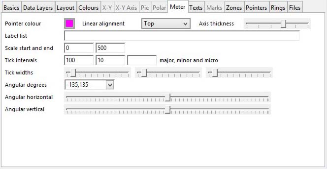
To change properties specific only to Meters and Gauges.
|
Field |
Description |
|---|---|
|
Pointer colour |
The pointer colour. Click to select from the colour picker. |
|
Linear alignment |
For linear meters, choose the alignment from the list. |
|
Axis thickness |
Use the slider to set the thickness of the axis. |
|
Label list |
A comma separated list of labels for each major tick mark label for the meter. If something is entered here, the normal numeric custom axis labelling will not apply. Instead the labels listed will be evenly distributed along the axis. If only one is entered it will be at the base. For example, if you enter Low,Medium,High the axis base will show Low, the high end will show High and at the centre will be Medium. You can use CDML syntax. |
|
Scale start and end |
The absolute value of the start and end of the meter range. |
|
Tick intervals |
The major, minor and micro tick intervals for the meter. |
|
Tick widths |
Use the sliders to change the tick line widths. |
|
Angular degrees |
Enter a pair of + or – degrees from where the angular meter starts and stops, or select from the list. |
|
Angular horizontal position |
Use the slider to set the angular metre horizontal position in the graph space. |
|
Angular vertical position |
Use the slider to set the angular metre vertical position in the graph space. |
Texts
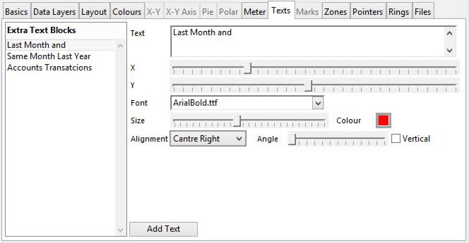
To add extra text blocks to the graph.
|
Field |
Description |
|---|---|
|
Extra Text Blocks list |
A list of extra text blocks for this graph. Use the delete key to remove unwanted ones. Click to show and edit details on the right. |
|
Text |
The text for the block. You can use CDML syntax. |
|
X and Y position |
Use the sliders to position the text block. |
|
Font |
The font name or default font for the text. (Default) or blank will lead to the default being used, typically Times Roman. Any other Font needs to be located in the Fonts folder of the Omnis executable. Any fonts present will be listed. See Introduction to Graphs 2 for details about font use. |
|
Size of the text |
Use the slider to set the font size for the text. |
|
Text colour |
The default text colour. Click to select from the colour picker. |
|
Alignment |
The alignment of the text within the block. |
|
Angle of the text block |
Use the slider to set the angle of rotation of the text block. |
|
Vertical |
If checked the text will be drawn one letter below the next. |
|
Button |
Action |
|---|---|
|
Add Text |
Click to add a text block to the graph. |
Marks
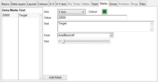
To add extra marks to an axis of a graph or linear meter.
|
Field |
Description |
|---|---|
|
Extra Marks Text list |
A list of extra marks for axis on this graph. Use the delete key to remove unwanted ones. Click to show and edit details on the right. |
|
Axis |
Choose from the list which axis it will apply to. |
|
Text and line colour |
The text and line colour. Click to select from the colour picker. |
|
Value |
The absolute value of the mark or the data source name for the value. You cannot use % value syntax. There is an in-depth explanation of alternative methods of populating graph data in the Introduction to Graphs 2, Data Sources section. Right-click to get a menu of extra functions. |
|
Text |
The text for the extra axis mark, if needed. |
|
Font |
The font name or default font for the text. (Default) or blank will lead to the default being used, typically Times Roman. Any other Font needs to be located in the Fonts folder of the Omnis executable. Any fonts present will be listed. See Introduction to Graphs 2 for details about font use. |
|
Size of the text |
Use the slider to set the font size for the text. |
|
Button |
Action |
|---|---|
|
Add Mark |
Click to add an axis mark to the graph. |
Zones
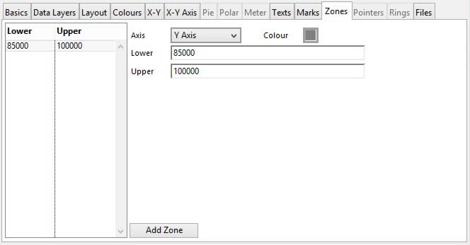
To add extra colour zones to an axis of a graph or to a meter.
|
Field |
Description |
|---|---|
|
Zone list |
A list of colour zones for axis on this graph or meter. Use the delete key to remove unwanted ones. Click to show and edit details on the right. |
|
Axis |
Choose from the list which axis it will apply to. |
|
Colour |
The zone colour. Click to select from the colour picker. |
|
Lower |
The absolute value of the lower limit of the zone or the data source name for it. You cannot use % value syntax. There is an in-depth explanation of alternative methods of populating graph data in the Introduction to Graphs 2, Data Sources section. Right-click to get a menu of extra functions. |
|
Upper |
The absolute value of the upper limit of the zone or the data source name for it. You cannot use % value syntax. There is an in-depth explanation of alternative methods of populating graph data in the Introduction to Graphs 2, Data Sources section. Right-click to get a menu of extra functions. |
|
Button |
Action |
|---|---|
|
Add Zone |
Click to add an axis colour zone to the graph or meter. |
Pointers
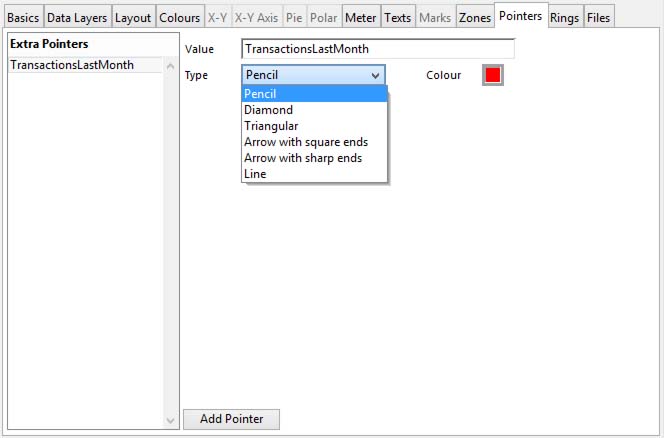
To add extra pointer to meter.
|
Field |
Description |
|---|---|
|
Extra Pointers for a meter |
A list of extra pointers for a meter. Use the delete key to remove unwanted ones. Click to show and edit details on the right. |
|
Value |
The absolute value (use % after) for the pointer or the data source name for the value. There is an in-depth explanation of alternative methods of populating graph data in the Introduction to Graphs 2, Data Sources section. Right-click to get a menu of extra functions. |
|
Type |
Choose from the available list the type of pointer to use. |
|
Colour |
The colour for the extra pointer. Click to select from the colour picker. |
|
Button |
Action |
|---|---|
|
Add Pointer |
Click to add an extra pointer to a meter. |
Rings

To add rings to an angular meter. Rings span the full 360 degrees of the meter, even when you have an angular limitation.
|
Field |
Description |
|---|---|
|
Rings list |
A list of rings or an angular meter. Use the delete key to remove unwanted ones. Click to show and edit details on the right. |
|
Inside |
The start radius of the ring. You can use % syntax, so 50% will start 50% out from the centre. Right-click to get a menu of extra functions. |
|
Outside |
The end radius of the ring. Likewise you can use % syntax. Right-click to get a menu of extra functions. |
|
Colour |
The colour for the ring. Click to select from the colour picker. |
|
Button |
Action |
|---|---|
|
Add Ring |
Click to add a colour ring to an angular meter. |
Files
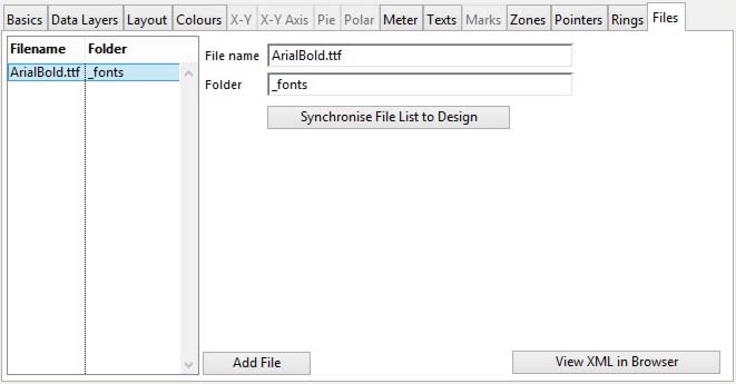
A list of additional files that the graph may need, typically fonts or images. For full details of the handling of external files see External Files (Images and Fonts).
|
Field |
Description |
|---|---|
|
Extra Files list |
A list of extra files that are used with this graph. Use the delete key to remove unwanted ones. Click to show and edit details on the right. |
|
File name |
The filename with suffix (case-sensitive on some platforms). E.G. sun.png |
|
Folder |
The folder the file will be sourced from. Either _fonts or _images. This determines both the server source and client destination of the file when downloaded. |
|
Button |
Action |
|---|---|
|
Add File |
Click to add a file associated with the graph. |
|
Synchronise File List to Design |
Click to synchronise the file list with the graph files specified. See External Files (Images and Fonts) for full details. |
| See also: – |
Compiled in Program Version 5.10. Help data last modified 4 Jun 2012 04:47:00.00. Class wG2Properties last modified 23 Sep 2017 10:50:54.
Reference Contents > Graphs 2 > Graphs 2 Properties